Stats
Actions
Available In
Tags
By mckinsey
Design, build, and test Vizro dashboards from concept to deployment using a structured 2-phase workflow that covers requirements, layout design, visualization selection, Python implementation, and Playwright-based testing.
Use this skill to build, implement, and test Vizro dashboards (Phase 2). Activate when the user wants to create a working app, says "just build it", or has data ready for implementation. Requires spec files from the dashboard-design skill (Phase 1), or user confirmation to skip design.
Use this skill first when the user wants to design or plan a dashboard, especially Vizro dashboards. Enforces a 3-step workflow (requirements, layout, visualization) before implementation. Activate when the user asks to create, design, or plan a dashboard. For implementation, use the dashboard-build skill after completing Steps 1-3.
Use this skill when designing or building Vizro dashboard layouts — grid configuration, component sizing, filter/parameter placement, selector types, or container patterns. Activate when the user is creating wireframes, defining page structure, placing controls, or sizing charts.
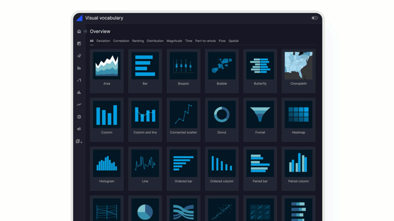
Use this skill when choosing chart types, applying Plotly Express conventions, configuring colors, or building KPI cards for Vizro dashboards. Activate when the user asks which chart fits their data, needs custom chart functions, wants to set colors or palettes, or is creating KPI metric cards.
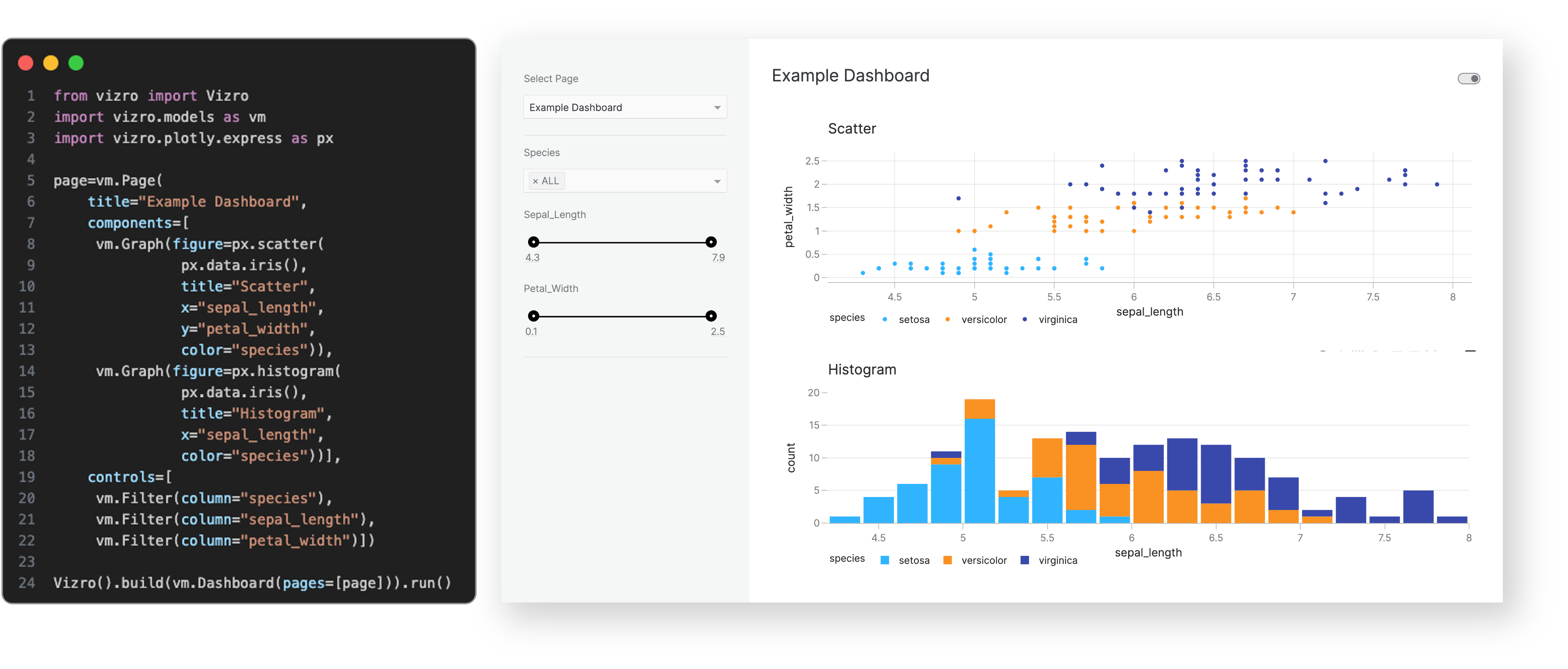
Use this skill when writing or debugging Vizro YAML dashboard configurations — component syntax, data_manager registration, custom function wiring, filter/parameter setup, or AG Grid tables. Activate when the user is building a Vizro app, encountering YAML or runtime errors, or asking about Vizro component patterns.
Own this plugin?
Verify ownership to unlock analytics, metadata editing, and a verified badge. GitHub access is read-only (username + org membership).
Sign in to claimOwn this plugin?
Verify ownership to unlock analytics, metadata editing, and a verified badge. GitHub access is read-only (username + org membership).
Sign in to claimnpx claudepluginhub mckinsey/vizro --plugin vizro-e2e-flowBased on adoption, maintenance, documentation, and repository signals. Not a security audit or endorsement.

![]()
![]()
![]()
Vizro is an open-source Python-based toolkit.
Use it to build beautiful and powerful data visualization apps quickly and easily, without needing advanced engineering or visual design expertise.
Then customize and deploy your app to production at scale.
In just a few lines of simple low-code configuration, with in-built visual design best practices, you can quickly assemble high-quality, multi-page prototypes, that are production-ready.
Every Vizro app is defined by a simple configuration, using these high-level categories:
Configuration can be written in multiple formats including Pydantic models, JSON, YAML or Python dictionaries for added flexibility of implementation.
Optional high-code extensions enable almost infinite customization in a modular way, combining the best of low-code and high-code - including bespoke visual formatting and custom components.
Visit our "How-to guides" for a more detailed explanation of Vizro features.
The benefits of the Vizro toolkit include:

Vizro helps you to build data visualization apps that are:
Quick and easy
Build apps in minutes. Use a few lines of simple configuration (via Pydantic models, JSON, YAML, or Python dictionaries) in place of thousands of lines of code.
Beautiful and powerful
Build high-quality multi-page apps without needing advanced engineering or visual design expertise. Use powerful features of production-grade BI tools, with in-built visual design best practices.
Flexible
Benefit from the capabilities and flexibility of open-source packages. Use the trusted dependencies of Plotly, Dash, and Pydantic.
Customizable
Almost infinite control for advanced users. Use Python, JavaScript, HTML and CSS code extensions.
Scalable
Designs effective KPI dashboards with proper metric selection, visual hierarchy, and data visualization best practices. Use when building executive dashboards, creating analytics views, or presenting business metrics.
Create beautiful, self-contained HTML visualizations from any content or idea. Use for slide decks, dashboards, infographics, flowcharts, timelines, cheat sheets, posters, and more.
Connect to Looker and interact with your data using LookML.
Data analytics & BI engineer — dashboards, metrics design, reporting, data storytelling
Write SQL, explore datasets, and generate insights faster. Build visualizations and dashboards, and turn raw data into clear stories for stakeholders.
Create data visualizations and plots
'%20stop-opacity%3D'0.16'%2F%3E%3Cstop%20offset%3D'1'%20stop-color%3D'rgb(200%2C90%2C60)'%20stop-opacity%3D'0.03'%2F%3E%3C%2FlinearGradient%3E%3C%2Fdefs%3E%3Crect%20width%3D'320'%20height%3D'200'%20fill%3D'url(%23g)'%2F%3E%3Ccircle%20cx%3D'250'%20cy%3D'56'%20r%3D'92'%20fill%3D'rgb(200%2C90%2C60)'%20fill-opacity%3D'0.06'%2F%3E%3Ccircle%20cx%3D'64'%20cy%3D'172'%20r%3D'58'%20fill%3D'rgb(200%2C90%2C60)'%20fill-opacity%3D'0.05'%2F%3E%3C%2Fsvg%3E)