Stats
Actions
Available In
Tags
A set of beautifully designed components that you can customize, extend, and build on. Start here then make it your own. Open Source. Open Code. Use this to build your own component library.
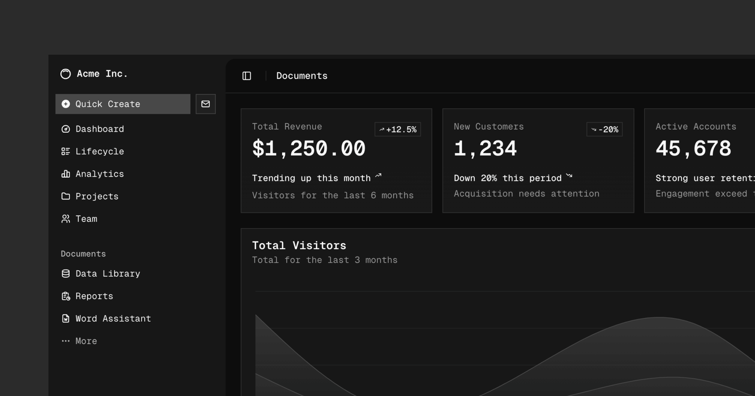
Visit https://ui.shadcn.com/docs to view the documentation.
Please read the contributing guide.
Licensed under the MIT license.
Based on adoption, maintenance, documentation, and repository signals. Not a security audit or endorsement.
Vercel's components build system for creating reusable UI components. Streamlines component development, testing, and distribution workflows.
 vercel
Expert shadcn/ui with Radix UI and Base UI detection, component patterns, registries, theming, and migration
 fusengine
ShadcnBlocks integration with intelligent block selection. Uses multi-dimensional tagging (layout, tone, goal, media, interaction) and guided 1-2 question flow to recommend the best-fit blocks from 1,338 premium blocks and 1,189 free components.
 masonjames
MCP server for shadcn UI tooling
 JNLei
JNLeinpx claudepluginhub p/shadcn-shadcn-skills-shadcnBuild React UIs with shadcn/ui — the open-code component system. Covers 58+ components (Base UI and Radix variants), CLI commands, components.json configuration, CSS variable theming (OKLCH), framework installation (Next.js, Vite, Astro, Remix, Laravel, Gatsby, TanStack), registry system, form patterns (React Hook Form, TanStack Form, Server Actions), dark mode, RTL, and monorepo setup.
 vcode-sh
Complete UI/UX design system for React Native & Next.js with 4 core skills
 apexscaleai
Own this plugin?
Verify ownership to unlock analytics, metadata editing, and a verified badge. GitHub access is read-only (username + org membership).
Sign in to claimOwn this plugin?
Verify ownership to unlock analytics, metadata editing, and a verified badge. GitHub access is read-only (username + org membership).
Sign in to claim
'%20stop-opacity%3D'0.16'%2F%3E%3Cstop%20offset%3D'1'%20stop-color%3D'rgb(200%2C90%2C60)'%20stop-opacity%3D'0.03'%2F%3E%3C%2FlinearGradient%3E%3C%2Fdefs%3E%3Crect%20width%3D'320'%20height%3D'200'%20fill%3D'url(%23g)'%2F%3E%3Ccircle%20cx%3D'250'%20cy%3D'56'%20r%3D'92'%20fill%3D'rgb(200%2C90%2C60)'%20fill-opacity%3D'0.06'%2F%3E%3Ccircle%20cx%3D'64'%20cy%3D'172'%20r%3D'58'%20fill%3D'rgb(200%2C90%2C60)'%20fill-opacity%3D'0.05'%2F%3E%3C%2Fsvg%3E)