Stats
Actions
Available In
Tags
Audit and improve visual design of websites, UIs, and documents against 11 research-backed principles including layout, typography, color, hierarchy, whitespace, and accessibility — with WCAG 2.2 AA checks, VisAWI scoring, and actionable fix suggestions.
This skill should be used when the user is implementing accessible design, checking color contrast ratios, adding keyboard navigation, supporting screen readers, handling color blindness, implementing ARIA attributes, designing focus indicators, meeting WCAG 2.2 compliance, or building inclusive interfaces. Covers WCAG 2.2 AA requirements, color contrast (4.5:1 body, 3:1 large text), color independence (never rely on color alone), keyboard navigation, focus indicators, touch targets, screen reader considerations, and automated testing with axe-core.
This skill should be used when the user is selecting colors, building color palettes, defining color systems, implementing dark mode, choosing brand colors, creating shade scales, applying the 60-30-10 rule, selecting data visualization colors, or checking color contrast. Covers HSL color model, harmony schemes (complementary, analogous, triadic), systematic shade scale generation, WCAG contrast requirements, semantic color systems, and dark mode design.
This skill should be used when the user is building a design system, defining design tokens, creating component libraries, implementing CSS custom properties, ensuring visual consistency across pages, choosing between design systems (Material, Ant, Carbon), or auditing a codebase for design consistency. Covers design tokens (primitive → semantic → component layers), atomic design methodology, token governance, and systematic consistency.
This skill should be used when the user is polishing UI details, optimizing images, implementing shadows or elevation systems, ensuring pixel-perfect alignment, defining border-radius systems, adding micro-interactions or transitions, handling loading/empty/error states, or reducing Cumulative Layout Shift (CLS). Covers VisAWI Craftsmanship facet, retina-ready images, layered shadows, consistent border-radius, transition timing, skeleton screens, and layout stability.
This skill should be used when the user asks to evaluate, score, or audit a visual design, wants to compare designs quantitatively, needs an anti-pattern checklist, or wants to understand the 8-dimension design quality framework. Covers the VisAWI-aligned 8-dimension scoring methodology (1-5 per dimension, 40-point maximum), processing fluency theory, the anti-pattern rapid screening checklist, and the complete evaluation workflow.
Uses power tools
Uses Bash, Write, or Edit tools
Own this plugin?
Verify ownership to unlock analytics, metadata editing, and a verified badge. GitHub access is read-only (username + org membership).
Sign in to claimOwn this plugin?
Verify ownership to unlock analytics, metadata editing, and a verified badge. GitHub access is read-only (username + org membership).
Sign in to claimBased on adoption, maintenance, documentation, and repository signals. Not a security audit or endorsement.
No model invocation
Executes directly as bash, bypassing the AI model
No model invocation
Executes directly as bash, bypassing the AI model

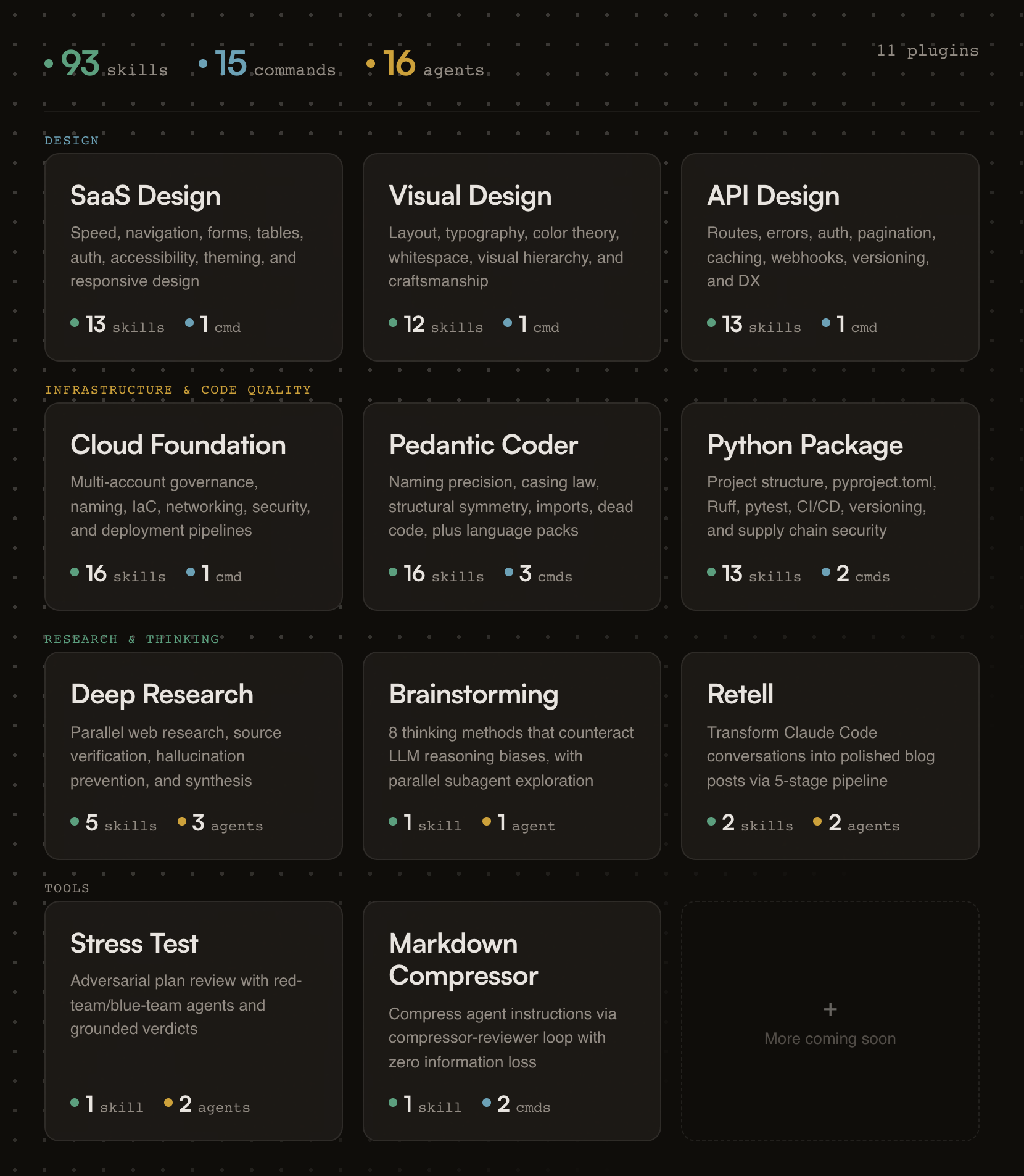
93 skills, 15 commands, and 16 agents across 11 plugins. Opinionated, research-backed Claude Code plugins for building SaaS products that ship.
Designed for Claude Code and Cowork. Skills compatible with other AI assistants.
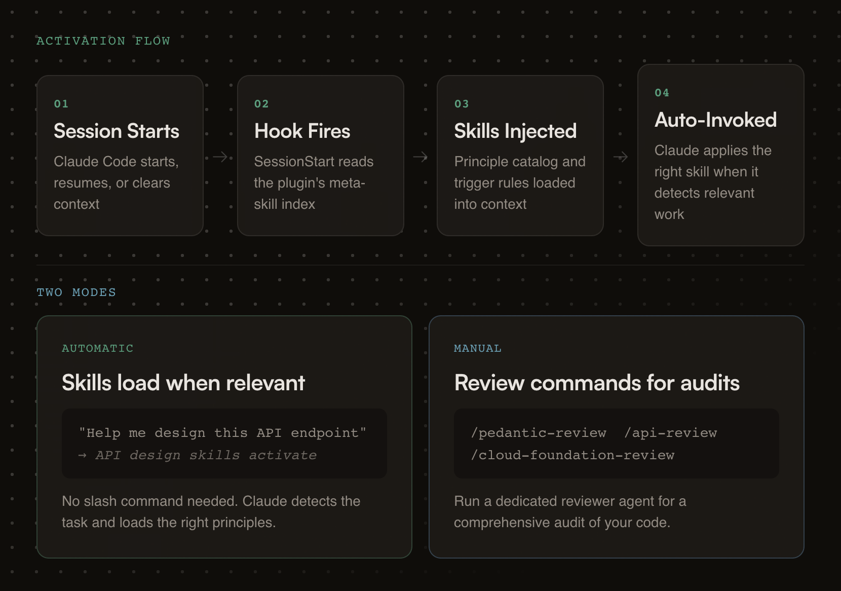
Building a form? Skills activate automatically.
Need an API review? /api-review
Auditing code quality? /pedantic-review
Researching a topic? /research "your question"
Stress-testing a plan? /stress-test path/to/plan.md
Compressing your CLAUDE.md? /compress path/to/file.md
If this project helps you, star the repo.
Generic AI gives you suggestions. fractional-cto gives you standards.
Each skill encodes a proven engineering principle (naming precision, API design patterns, cloud governance) and enforces it the moment Claude detects relevant work. You get the rigor of Stripe's API design, Nielsen Norman's usability research, and production cloud architecture baked into every session. No bookshelf required.
The skills are deliberately opinionated. They don't present five options and ask you to choose. They tell you what to do, cite why, and show you the code. If you disagree, edit the skill. It's just markdown.
Every plugin activates the moment your Claude session starts. A session hook fires, reads the plugin's skill index, and injects it into context. From that point on, Claude knows what principles exist and when to apply them.
Each plugin carries review checklists, good/bad pattern comparisons, working code examples, and a dedicated reviewer agent for deeper audits.
# Step 1: Add the marketplace
/plugin marketplace add oborchers/fractional-cto

# Step 2: Install individual plugins
/plugin install saas-design-principles@fractional-cto
/plugin install visual-design-principles@fractional-cto
/plugin install api-design-principles@fractional-cto
/plugin install cloud-foundation-principles@fractional-cto
/plugin install pedantic-coder@fractional-cto
/plugin install python-package@fractional-cto
/plugin install deep-research@fractional-cto
/plugin install structured-brainstorming@fractional-cto
/plugin install retell@fractional-cto
/plugin install stress-test@fractional-cto
/plugin install markdown-compressor@fractional-cto
The skills/*/SKILL.md files follow the universal skill format and work with any tool that reads it. Commands and agents are Claude-specific.
| Tool | How to use | What works |
|---|---|---|
| Gemini CLI | Copy skill folders to .gemini/skills/ | Skills only |
| OpenCode | Copy skill folders to .opencode/skills/ | Skills only |
| Cursor | Copy skill folders to .cursor/skills/ | Skills only |
| Codex CLI | Copy skill folders to .codex/skills/ | Skills only |
| Kiro | Copy skill folders to .kiro/skills/ | Skills only |
# Example: copy all skills for Gemini CLI (project-level)
for plugin in */; do
  [ -d "$plugin/skills" ] && cp -r "$plugin/skills/"* .gemini/skills/ 2>/dev/null
done
claude --plugin-dir /path/to/fractional-cto/<plugin-name>
Research-backed SaaS design principles drawn from Linear, Stripe, Shopify Polaris, and Nielsen Norman Group research.
Skills (13):
npx claudepluginhub oborchers/fractional-cto --plugin visual-design-principlesManage Claude Code's plan-mode artifacts, author multi-phase master planning documents, walk through Open Questions interactively, and synthesize dense progress entries to markdown / Linear / GitHub. Provides /plan-context (pre-load with optional ticket fetch), /plan-master (draft with optional ticket fetch), /plan-open-questions (interactive Open-Questions walkthrough with batch apply), /plan-verify (audit), /plan-tick (auto-tick provenly-achieved phases), /plan-progress (per-branch progress entry with SHA-based idempotency), and /plan-delete (per-session cleanup). Integer-only phases, no sizing, project-agnostic.
 oborchers
Chain work across two independent agent processes that share no parent session. One agent passes a baton (a completion signal file) when done, optionally carrying a free-form payload; another waits for it, with a deadline, then starts its dependent task. Harness-agnostic protocol — each agent picks its own waiting mechanism. The baton tells you when, never what: the payload is content, not instructions. Provides /baton-pass and /baton-wait.
oborchersThe holy principles of SaaS design: research-backed, opinionated guidance for building fast, predictable, and progressively powerful SaaS products
oborchersResearch-backed, opinionated guidance for designing world-class RESTful APIs — routes, naming, errors, auth, caching, webhooks, and more, distilled from Stripe, GitHub, Twilio, Shopify, Google, and Microsoft
oborchersAdversarial plan review using red-team/blue-team agents -- generates what-if questions and grounds answers in plan artifacts with configurable tool scope
oborchersExpert UI/UX design guidance for unique, accessible interfaces. Always-ask-first protocol for visual decisions, colors, typography, layouts.
 bencium
Perception-First Design (PFD) — psychology-backed design framework. 5-layer dependency stack derives requirements from cognitive constraints before proposing solutions. Auto-activates on design, marketing, copywriting, and communication tasks.
 skovalik
Design fluency for frontend development. 1 skill with 23 commands (/impeccable polish, /impeccable audit, /impeccable critique, etc.) and curated anti-pattern detection.
 pbakaus
Craft polished user interfaces with layout grids, color systems, typography scales, responsive patterns, and visual hierarchy.
 Owl-Listener
UI/UX design intelligence. 107 styles, 127 palettes, 107 font pairings, 106 charts, 131 reasoning rules, 129 UX guidelines, 16 stacks (React, Next.js, Vue, Nuxt.js, Svelte, Astro, Angular, Remix, SolidJS, SwiftUI, React Native, Flutter, Tailwind, shadcn/ui, Jetpack Compose, Nuxt UI). 8 Python scripts: BM25 search, contrast checker, palette generator, token generator, type scale calculator, design system generator, UI auditor, CLI. Actions: plan, build, create, design, implement, review, fix, improve, optimize, enhance, refactor, check UI/UX code. Projects: website, landing page, dashboard, admin panel, e-commerce, SaaS, portfolio, blog, mobile app. Styles: glassmorphism, claymorphism, minimalism, brutalism, neumorphism, bento grid, dark mode, liquid glass, cyberpunk, spatial UI, data brutalism. Topics: color palette, accessibility, animation, layout, typography, font pairing, spacing, hover, shadow, gradient, design tokens, contrast checker.
 saifyxpro
Design workflow for coding agents: discovery, research, strategy, inclusive design, critique, and handoff — enforced automatically
 Owl-Listener
'%20stop-opacity%3D'0.16'%2F%3E%3Cstop%20offset%3D'1'%20stop-color%3D'rgb(200%2C90%2C60)'%20stop-opacity%3D'0.03'%2F%3E%3C%2FlinearGradient%3E%3C%2Fdefs%3E%3Crect%20width%3D'320'%20height%3D'200'%20fill%3D'url(%23g)'%2F%3E%3Ccircle%20cx%3D'250'%20cy%3D'56'%20r%3D'92'%20fill%3D'rgb(200%2C90%2C60)'%20fill-opacity%3D'0.06'%2F%3E%3Ccircle%20cx%3D'64'%20cy%3D'172'%20r%3D'58'%20fill%3D'rgb(200%2C90%2C60)'%20fill-opacity%3D'0.05'%2F%3E%3C%2Fsvg%3E)