> Although the most effective experiences are approachable and intuitive, you can provide contextual help when necessary.
Generates contextual help content and tips for Apple platform apps following HIG guidelines.
/plugin marketplace add shepherdjerred/monorepo/plugin install jerred@shepherdjerredOffering help | Apple Developer Documentation
Although the most effective experiences are approachable and intuitive, you can provide contextual help when necessary.
Source: https://developer.apple.com/design/human-interface-guidelines/offering-help
Offering help
Although the most effective experiences are approachable and intuitive, you can provide contextual help when necessary.

Best practices
Let your app’s tasks inform the types of help people might need. For example, you might help people perform simple, one- or two-step tasks by displaying an inline view that succinctly describes the task. In contrast, if your app or game supports complex or multistep tasks you might want to provide a tutorial that teaches people how to accomplish larger goals. In general, directly relate the help you provide to the precise action or task people are doing right now and make it easy for people to dismiss or avoid the help if they don’t need it.
Use relevant and consistent language and images in your help content. Always make sure guidance is appropriate for the current context. For example, if someone’s using the Siri Remote with your tvOS experience, don’t show tips or images that feature a game controller. Also be sure the terms and descriptions you use are consistent with the platform. For example, don’t write copy that tells people to click a button on an iPhone or tap a menu item on a Mac.
Make sure all help content is inclusive. For guidance, see Inclusion.
Avoid bloating your help content by explaining how standard components or patterns work. Instead, describe the specific action or task that a standard element performs in your app or game. If your experience introduces a unique control or expects people to use an input device in a nonstandard way — such as holding the Siri Remote rotated 90 degrees — orient people quickly, preferring animation or graphics to educate instead of a lengthy description.
Creating tips
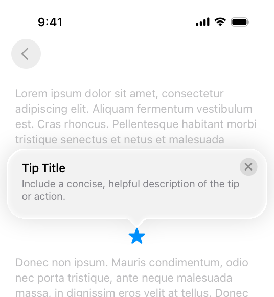
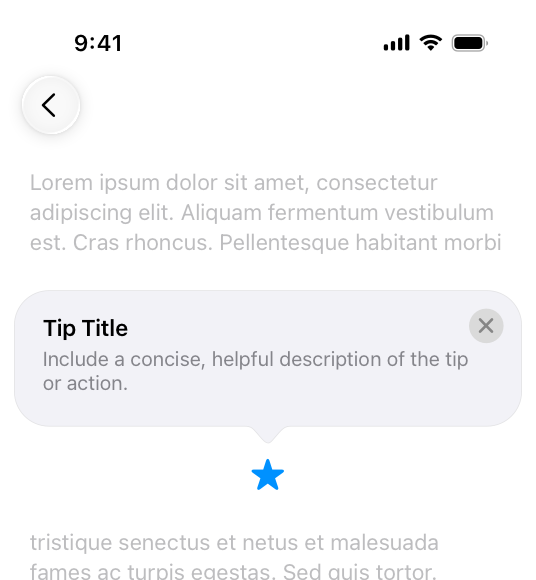
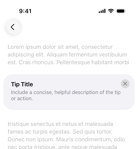
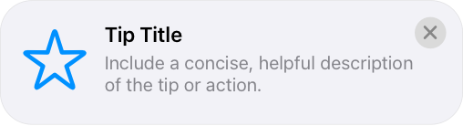
A tip is a small, transient view that briefly describes how to use a feature in your app. Tips are a great way to teach people about new or less obvious features in your app, or help them discover faster ways to accomplish a task. For developer guidance, see TipKit.
Use the most appropriate tip type for your app’s user interface. Display a popover tip when you want to preserve the content flow, or an inline tip when you want to ensure that surrounding information is visible. You can use an annotation-style inline tip when pointing to a specific UI element, or a hint-style tip when it’s not related to a specific piece of UI.
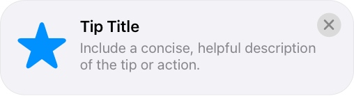
Popover
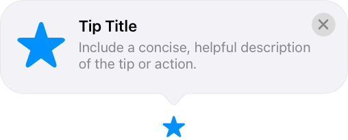
Annotation
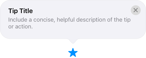
Hint
Use tips for simple features. Tips work best on features that are easy to describe and that people can complete with a few simple steps. If a feature requires more than three actions, it’s probably too complicated for a tip.
Make tips short, actionable, and engaging. A tip’s goal is to encourage people to try new features. Use direct, action-oriented language to describe what the feature does and explain how to use it. Keep your tips to one or two sentences and avoid including content that’s promotional or related to a different feature or user flow. Promotional content is anything that advertises, sells, or isn’t aligned with the current context of what the person is doing.
Define rules to help ensure your tips reach the intended audience. Not everyone benefits from every tip. For example, people who’ve already used a feature won’t appreciate viewing a tip that describes it. Use parameter-based or event-based eligibility rules to control when a tip appears, and only display a tip if someone might benefit from its use. When your app has more than one tip, set the display frequency so tips display at a reasonable cadence — for example, once every 24 hours.
If there’s an image or symbol that people associate with the feature, consider including it in the tip, and prefer the filled variant. For example, a tip with a star can help people understand that the tip is related to favorites.


If the feature is represented by an image that the tip connects to directly, avoid repeating the same image in both the tip and the UI.
Use buttons to direct people to information or options. If your feature has settings people can customize, or you want to redirect people to an area where they can learn more about a feature, consider adding a button. Buttons can take people directly to the settings where they make adjustments. Or if there’s more information people might find useful, add a button to take them to additional resources, such as a setup flow.
Platform considerations
No additional considerations for iOS, iPadOS, tvOS, or watchOS.
macOS, visionOS
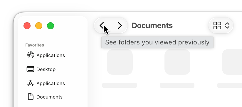
A tooltip (called a help tag in user documentation) displays a small, transient view that briefly describes how to use a component in the interface. In apps that run on a Mac — including iPhone and iPad apps — tooltips can appear when a person holds the pointer over an element; in visionOS apps, a tooltip can appear when a person looks at an element or holds the pointer over it. For developer guidance, see help(_:).
Describe only the control that people indicate interest in. When people want to know how to use a specific control, they don’t want to learn how to use nearby controls or how to perform a larger task.
Explain the action or task the control initiates. It often works well to begin the description with a verb — for example, “Restore default settings” or “Add or remove a language from the list.”
In general, avoid repeating a control’s name in its tooltip. Repeating the name takes up space in the tooltip and rarely adds value to the description.
Be brief. As much as possible, limit tooltip content to a maximum of 60 to 75 characters (note that localization often changes the length of text). To make a description brief and direct, consider using a sentence fragment and omitting articles. If you need a lot of text to describe a control, consider simplifying your interface design.
Use sentence case. Sentence case tends to appear more casual and approachable. If you write complete sentences, omit ending punctuation unless it’s required to be consistent with your app’s style.
Consider offering context-sensitive tooltips. For example, you could provide different text for a control’s different states.
Resources
Related
Developer documentation
NSHelpManager — AppKit
Videos
[
Make features discoverable with TipKit](https://developer.apple.com/videos/play/wwdc2023/10229)
Change log
| Date | Changes |
|---|---|
| December 5, 2023 | Included visionOS in guidance for creating tooltips. |
| September 12, 2023 | Added guidance for creating tips. |
Similar Agents
Use this agent to verify that a Python Agent SDK application is properly configured, follows SDK best practices and documentation recommendations, and is ready for deployment or testing. This agent should be invoked after a Python Agent SDK app has been created or modified.
Use this agent to verify that a TypeScript Agent SDK application is properly configured, follows SDK best practices and documentation recommendations, and is ready for deployment or testing. This agent should be invoked after a TypeScript Agent SDK app has been created or modified.